Sign up for ContactNow

OVERVIEW
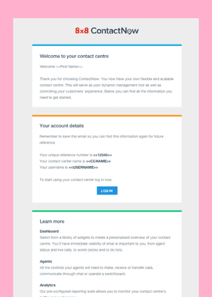
With the unification of the US and UK sign up process for ContactNow, the sign up process needed to be redesigned to accommodate the new information needed up front, required for the US.
The extra information meant that a UX restructure was required as well as a UI overhaul. My role in this project was to:
• Audit and research sign up pages
• Design new sign up process and pages
• Test mockups and iterate designs
• Create illustrations for sign up pages
• Worked with developers throughout sprints
• Check design and UX on the development work
ILLUSTRATIONS
I made these illustrations for the sign up pages; they were based on a common style that was used within the company as well as pre-existing illustrations.

DESIGN PROCESS
After an initial audit of the existing sign up process and research into other sign up pages, I began to break down the information needed to sign up into separate pages. The extra information required meant that a UX restructure was needed as well as a UI overhaul.The designs needed to be flexible as there was a slightly different process for UK and US users; this meant I had to work with developers to figure out the most efficient way to separate the process without giving up the integrity of the design. In the end the solution was to add localisation to the sign up process and keep the same UI.
CHALLENGES
The main challenge with this project was how to integrate the extra form fields into the sign up flow. This was resolved by appropriately splitting the sign up process into different sections by adding localisation.
OUTCOME
The sign up page was successfully developed and released with different user flows based on the localisation. ★


